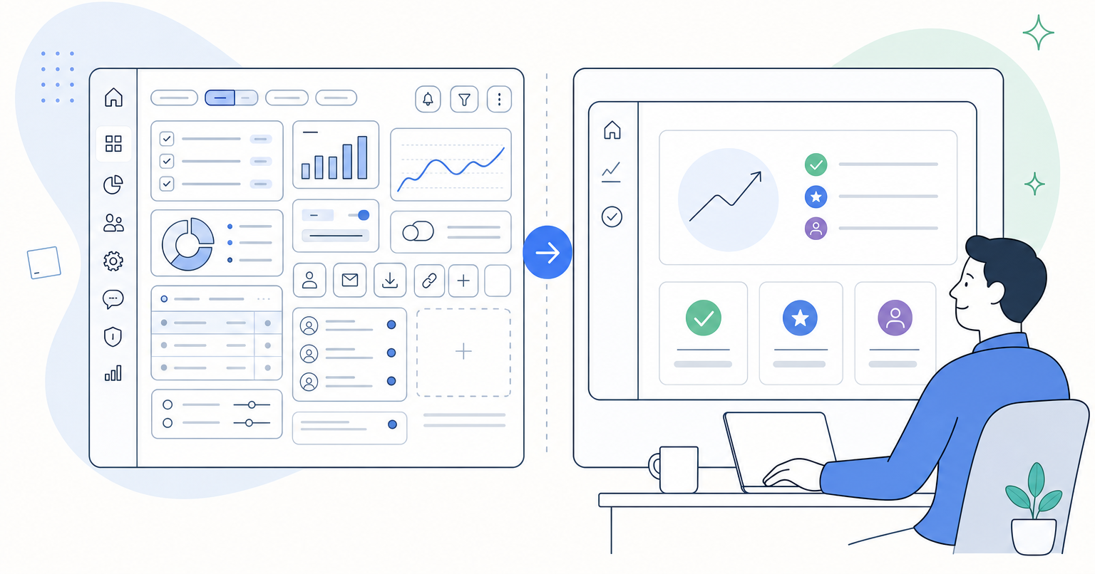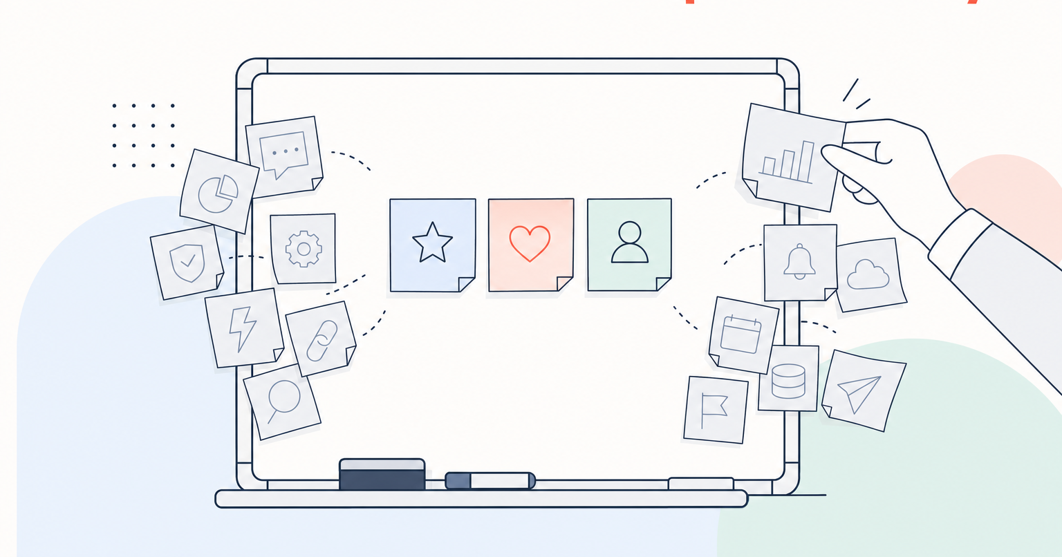
A SaaS company came to us with an explainer video that was, by their own admission, being ignored. Sales reps stopped sending it. The homepage had it buried below the fold. Analytics showed viewers dropping off in the first ten seconds. The video crammed roughly fifteen features into ninety seconds, opened with a founder introducing himself, and moved so fast that nothing landed. When we recut the messaging around three features and led with the buyer's pain instead of the company's history, the same product story became the piece their sales team reaches for first. Here is what changed and why.
The situation: a feature dump nobody finished
The original video followed a pattern we see constantly in B2B tech. A founder or product lead speaks to camera. They introduce themselves, then walk through every capability the platform offers: dashboards, integrations, permissions, reporting, workflows, automations, mobile, API. Every feature gets a slide. Every slide gets a sentence. The music is a steady loop. The energy line is flat from second one to second ninety.
The client's frustration was familiar: the content felt lifeless, the message did not hold attention, and prospects were not converting off it. When we watched the raw interview footage they sent over, the good material was there. It just was not being used.
What we tried: three features, pain first, movie-trailer pacing
Our recut moved on three decisions at once.
We cut the feature list from fifteen to three. We asked the client for the pains their best customers describe in sales calls. Then we listed every product feature and mapped it to a pain it directly relieves and an outcome it produces. Most features fell away in that mapping exercise. Three remained, each tied to a distinct pain and a distinct outcome, sequenced so the middle beat carried the heaviest emotional weight. There is a reason we hold to three: if you tell viewers everything, they remember nothing. If everything is exciting, nothing is exciting. Comprehension collapses under load.
We rebuilt the opening around a pain, not an introduction. The founder introducing himself got cut. In its place, the first four seconds named a problem the target viewer feels every week. The next few seconds spelled that pain out further, so the viewer felt understood before hearing a single word about the product. Only then did the video name the brand and add one or two positioning phrases about who they help and what outcomes they deliver. This is the Storybrand-inspired sequence we use across our work: hook the pain, position the guide, then present the plan.
We edited it like a trailer. We mapped the story turns, then trimmed and rearranged the music so its energy rose and fell in lockstep with the narrative. We built one impact moment around the strongest soundbite in the interview: music out, a short reverb tail on the cut, a riser underneath, then the music slams back in the instant the line finishes. It works like a period at the end of a powerful sentence. Viewers feel it even when they cannot name what happened.
The result
Same footage. Same product. Different film. The sales team started opening deals with it. It moved to the top of the homepage. Internal reactions shifted from polite nods to unprompted forwards. We do not have conversion data from the client to publish (getting access to post-launch performance data is something we are actively working to build into every engagement), but the qualitative shift was unmistakable: from a video no one finished to a video the team wanted attached to every outbound email.
Worth noting: a separate testimonial project followed a nearly identical pattern. A client sent us footage another agency had already cut into a video that fell flat. We reedited from the same raw tape into what became their most impactful testimonial to date, purely by selecting better soundbites, sequencing them into a story, and building rhythm with music and sound design. The lesson repeats.
The reusable takeaway
If your explainer is not converting, the problem is usually not production polish. It is architecture. Three moves fix most B2B tech videos:
- Narrow to three features, each mapped to a specific pain and a specific outcome. Cut the rest, even the features the product team loves.
- Open on the viewer's pain, not your founder's bio. The first four seconds decide whether the next eighty get watched.
- Edit the audio like the story matters, because it does. Music and sound design carry the emotional arc; a flat mix produces a flat video.
If you want a second pair of eyes on a video that is not landing, we do this work every week for mission-driven tech companies and specialize in SaaS explainer videos built around this exact discipline. More on how we think about scope and cost lives in our note on what determines the cost of a SaaS explainer video.