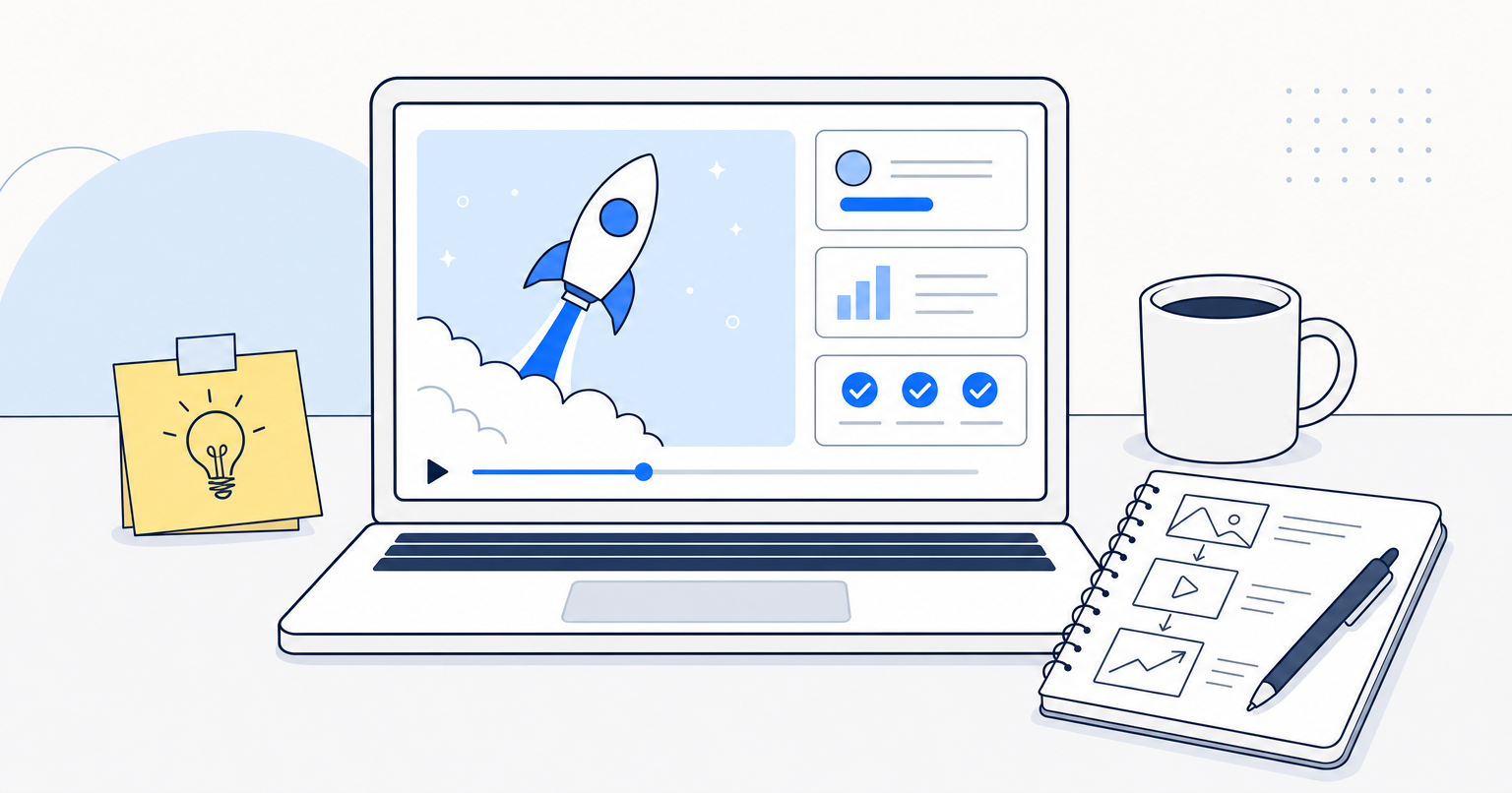
A product launch video drives signups when it opens on the viewer's pain in the first three seconds, positions your product as the guide with a clear plan, narrows the feature list down to three benefits mapped to real outcomes, and uses trailer-style pacing so the energy of the edit matches the energy of the story. Skip any one of those, and you get a video people scroll past.
Here is the process we run at Full Send for every launch, in the order it needs to happen.
Step 1: Start with the pain
Most launch videos open with a founder introducing themselves or a logo animation. Nobody cares yet. Those first few seconds decide whether the viewer keeps watching or bounces back to their inbox.
Open on the pain your product solves. Not a clever pain. The real one, said plainly, the way your customer would say it in a Slack DM at 4pm. Then spell it out for one more beat, so the viewer feels understood before you've asked them for anything.
If your product is a billing tool for freelance designers, you don't open with "Meet Ledgerly." You open with "You finished the project six weeks ago. You're still chasing the invoice."
Step 2: Position your product as the guide, not the hero
Once you've named the pain, the viewer is listening. Now introduce the brand, but only with 1 to 2 positioning phrases that say who you are, who you help, and what outcome you deliver. Not history. Not values. Not the founding story.
"Ledgerly is the invoicing tool built for solo designers who'd rather be designing than dunning."
That's it. The viewer is the hero. You are the guide who hands them a plan.
Step 3: Narrow the script to three features. Not five. Not seven.
This is where founders push back hardest, because you've spent 18 months building the product and everything feels essential. It isn't, at least not for a launch video.
If everything is exciting, nothing is exciting. If everything is loud, nothing is loud.
Pick the three features that map most directly to the pains and desired outcomes you named in step one. Sequence them logically so each one builds on the last. Save the rest for your feature page, your onboarding flow, and your next video. There's a whole framework for choosing an explainer video style that supports this same principle.
Step 4: Cut soundbites, don't script speeches
If you're using founder or customer interviews in the launch, resist the urge to write monologues. Record loose, get long-form answers, then pull the tightest 4 to 8 second soundbites and sequence them.
The sequencing is the story. The trim is the pacing. A great launch video is 80% edit decision, 20% shoot.
Step 5: Edit like a movie trailer, not a corporate explainer
This is the part almost every launch video gets wrong. Music isn't wallpaper. It's the emotional spine of the piece.
Map the turns of your story: the pain, the introduction of the product, the three features, the outcome. Then find a track and manually rearrange it so the energy of the song rises and falls in lock-step with those turns. Don't drop a track on the timeline and hope.
Create at least one impact moment: strip the music under a powerful soundbite, add a clean reverb tail on the cut, build a riser under it, and slam the music back in as the line lands. That's your punctuation mark. That's what makes a viewer text the link to a colleague.
Step 6: End on the outcome and one action
Close the video the same way you close a sales conversation. Restate the positive outcome. Show the product doing the thing. Then give one call to action. "Start free at ledgerly.com." Not three CTAs. One.
Step 7: Cut a 15-second version for paid
The homepage cut can breathe at 60 to 90 seconds. Your paid ads cannot. From the same footage, cut a 15-second version that hits pain, product, one benefit, CTA. Same story spine, radically compressed.
Where to go from here
A launch video that converts is a strategy problem before it's a production problem. If you want a second set of eyes on the story before you shoot, that's what our free video strategy session is built for, and our explainer video work shows what this framework looks like in the wild.
Ship the pain first. The signups follow.